blog 2023 3 min read
Exploring the current colours of Pride
In 2023, Pride Month looks a little bit different with the widespread sharing of the more current flag design, known as the Progress Flag, to bring awareness of both old and new challenges within the LGBTQ+ community. As we celebrate Pride Month, we dived into the inspiration for the flag and what meaning drove each new colour and design.
The original Pride flag design
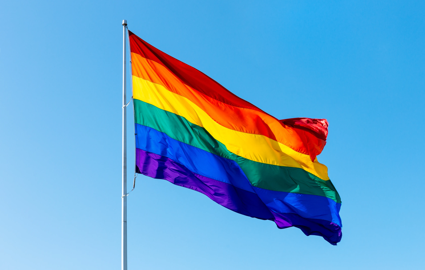
The original Pride flag was created by Gilbert Baker in 1978 to celebrate members of the gay and lesbian political movement by evoking the rainbow as a symbol of hope. Baker assigned a specific meaning to each colour: pink for attraction to the same gender, red for life, orange for healing, yellow for sunlight, green for nature, turquoise for magic, indigo for serenity and violet for spirit. A year later the pink and turquoise stripes were dropped owing to a shortage of pink fabric at the time and legibility concerns, resulting in the six-colour rainbow flag most commonly used in the first decades of the 21st century.

The new Pride flag design
The new design, created in 2018 by digital designer Daniel Quasar, was inspired by other pride flags—specifically, the Philadelphia Pride Flag from 2017 and the trans flag. The Philadelphia Pride Flag had black and brown vertical stripes added.
The trans flag, created in 1999, is pink, baby blue, and white. With these new additions in both colour and design, which are added to the existing Pride colours, the Progress flag aims to represent people of colour as well as those who are transgender, intersex, or non-binary.
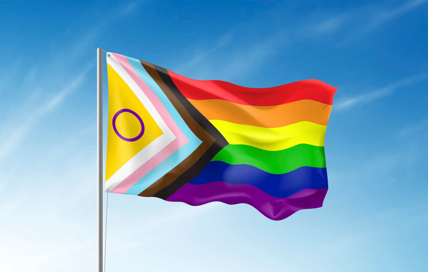
The word "progress" in the new flag isn't only about adding the new colours. It's also about the shape, which differs from the original design of horizontal stripes only. The Progress Pride Flag shows the white, pink, baby blue, black, and brown stripes in a triangle shape, with the old six-colour rainbow stacked next to them. This is meant to mark a shift in focusing on protecting the rights of those who are transgender, intersex, non-binary or are people of colour.
According to designer Qasar, the placement of these colours as an arrow shows that progress is still needed.
In 2021, this flag got an even more inclusive redesign recognising intersexuality as part of the movement. The new addition is a yellow section completed with a purple circle. It was devised by Morgan Carpenter, who works at Intersex Human Rights Australia.
At disguise, we are constantly looking to improve progress. By hiring from diverse backgrounds we aim to create a workplace where everyone feels like they belong.
This Pride Month, we will continue to support Rainbow Railroad, a charity providing safety to those that face violence and oppression simply because of who they love. We wish our LGBTQ+ members of our community including partners, team members and customers a very happy Pride Month.